Wakafrica - Buyer Shopping Experience
Designing with empathy, clarity, and accessibility in mind
Transforming a Complex Backend into Role-Specific Experiences
This section explores the mobile-first experience designed for buyers — often European users purchasing essential goods for their loved ones in Africa.
Here, the goal wasn’t just to build a transactional flow, but to design a bridge — one that connects people across continents, cultures, and bandwidth limitations.
I focused on creating a shopping journey that is:
Visually clear, even in low-connectivity environments
Emotionally relevant, encouraging users to feel personally connected to their beneficiary, and strengthening empathy and motivation throughout the experience.
Accessible by design, with careful attention to interface legibility, navigation consistency, and progressive disclosure.
This experience is a result of continuous iteration, system constraint negotiation, and a deep understanding of how emotions, usability and trust shape digital actions.
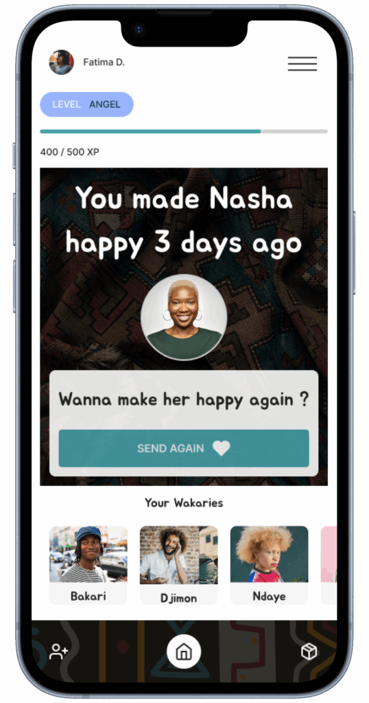
Buyer Shopping Experience
What is Wakafrica?
Wakafrica is a real-world UX/UI project developed as part of my diploma, now actively maintained in collaboration with the product team.
The platform connects European buyers with verified African vendors through a mobile-first shopping system. Users can send essential goods to their loved ones — the Wakaries — by selecting products based on category and delivery zone.
Orders are automatically matched with sellers in the selected delivery zone, based on operational logic.
Wakafrica aims to make cross-border support fast, transparent, and reliable — while adapting to regional constraints and device accessibility.
(Some platform mechanisms are protected by NDA and are not publicly disclosed.)
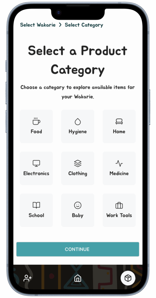
User Flow & Information Architecture
Based on internal discussions and usability testing,
I structured the core flows for vendors and buyers around clarity and speed.
The product owner provided functional requirements, and I translated them into logical flows and a scalable interface.
A clear representation of the platform’s content hierarchy and navigation structure, designed to guide both UX decisions and future system development.
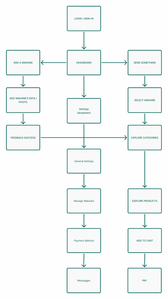
Swipe or scroll horizontally to explore the full User Story Map →
User Story Map
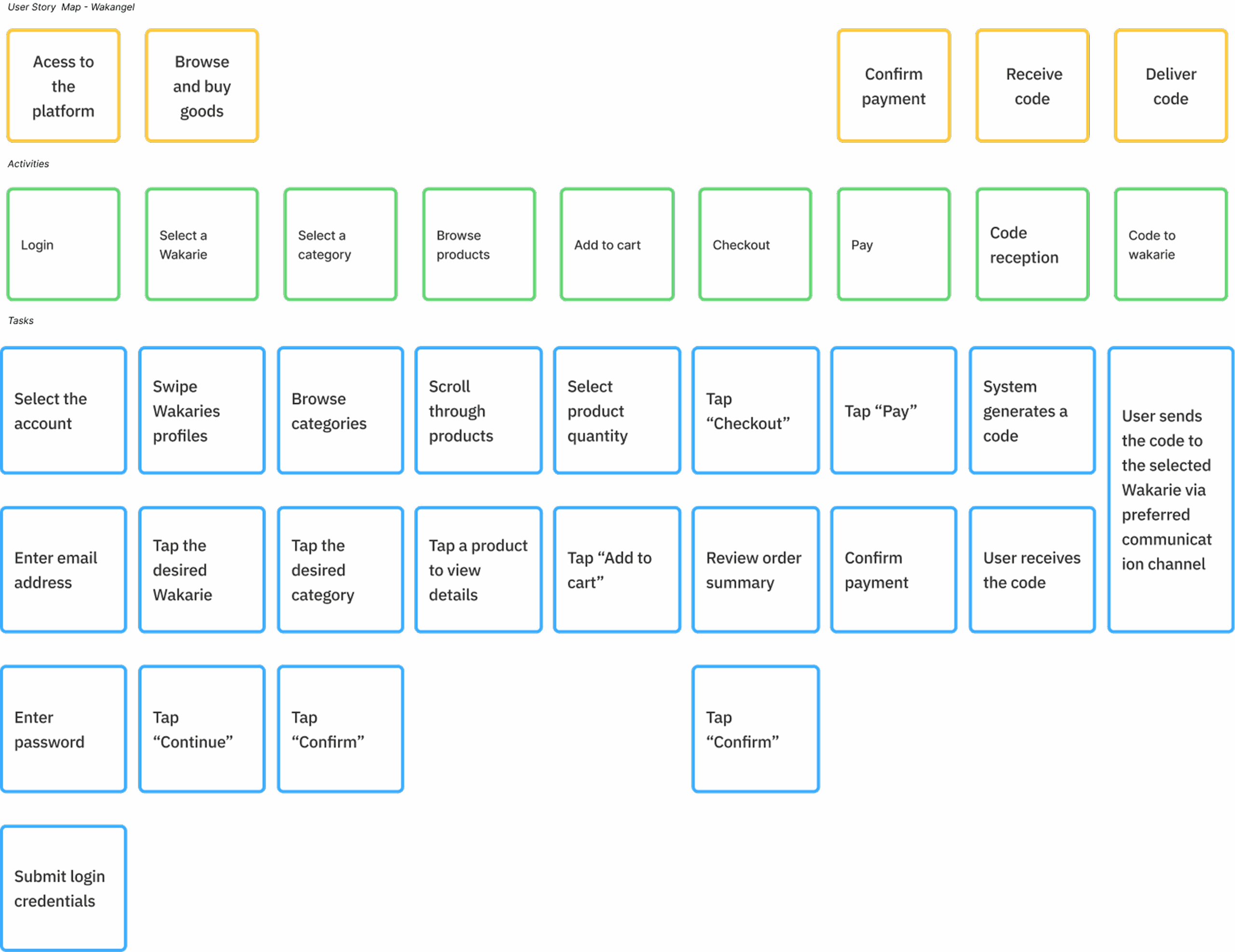
LOW FIDELITY WIREFRAME
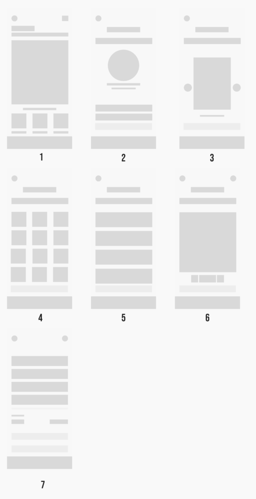
To define the core buyer flow, I started with low-fidelity wireframes focused on clarity, usability, and mobile-first prioritization.
Each screen represents a key step in the purchase journey, structured to reduce friction and ensure that the user stays in control from start to finish.
This phase allowed for fast iteration and validation of:
Navigation structure and screen-to-screen continuity
Information hierarchy per step
Entry points, CTAs and fallback states
Realistic alignment with delivery logic and vendor-side processing
The flow includes:
Home
Add a Wakary (recipient)
Select Wakary
Select Category
Select Products
Product Card (details, variations)
Cart and confirmation
From Dropdown to Cart-Centric Navigation
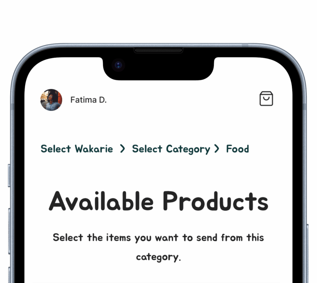
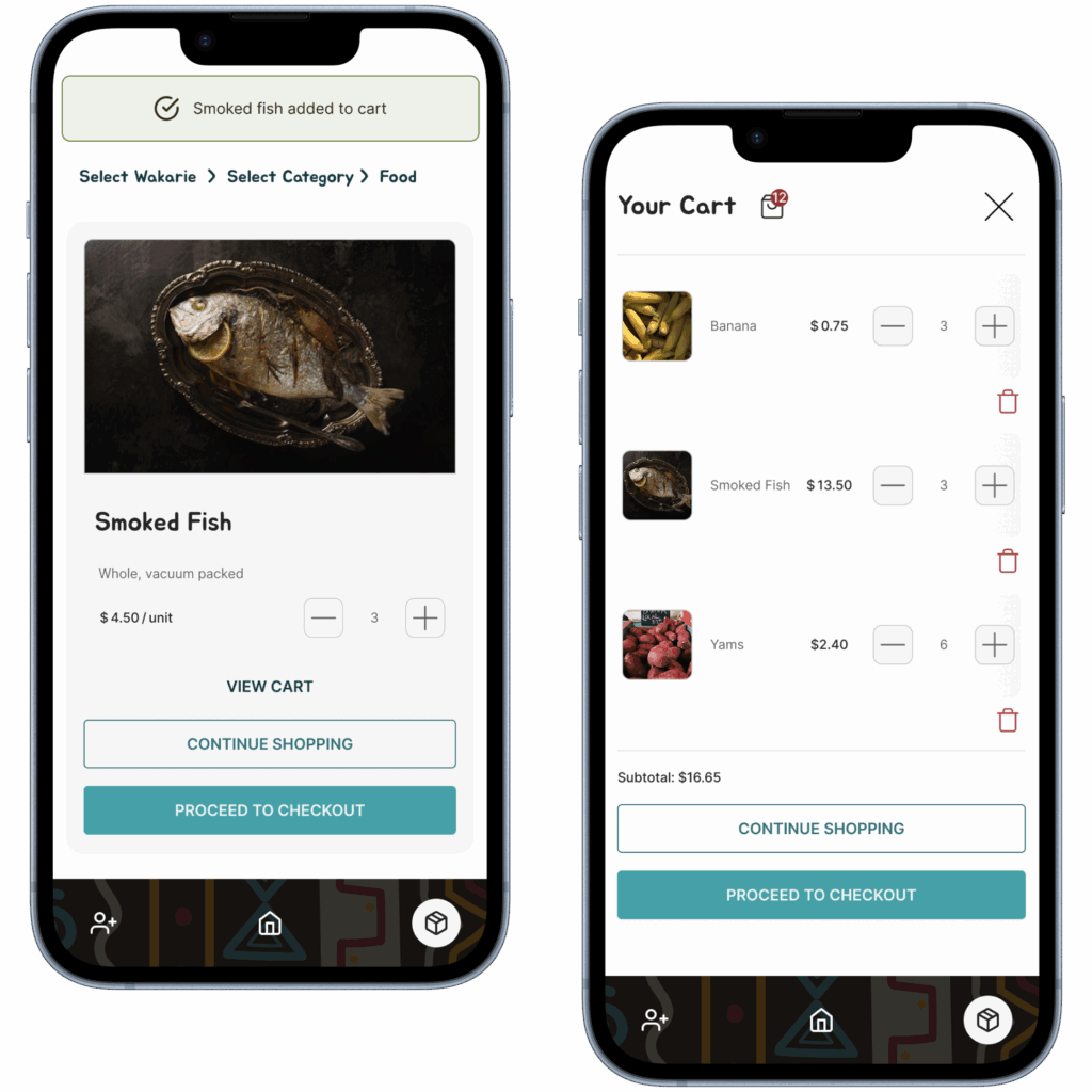
To reduce cognitive load and streamline the shopping experience, I shifted from a traditional dropdown navigation to a cart-centric flow within the shopping section.
This navigation keeps the cart as a persistent visual anchor, helping users stay focused and oriented throughout their shopping journey.
On the homepage: the dropdown provides quick access to global features and high-level actions.
Inside the shop: the cart becomes the primary navigation focus, guiding users through their selections.
Error Prevention
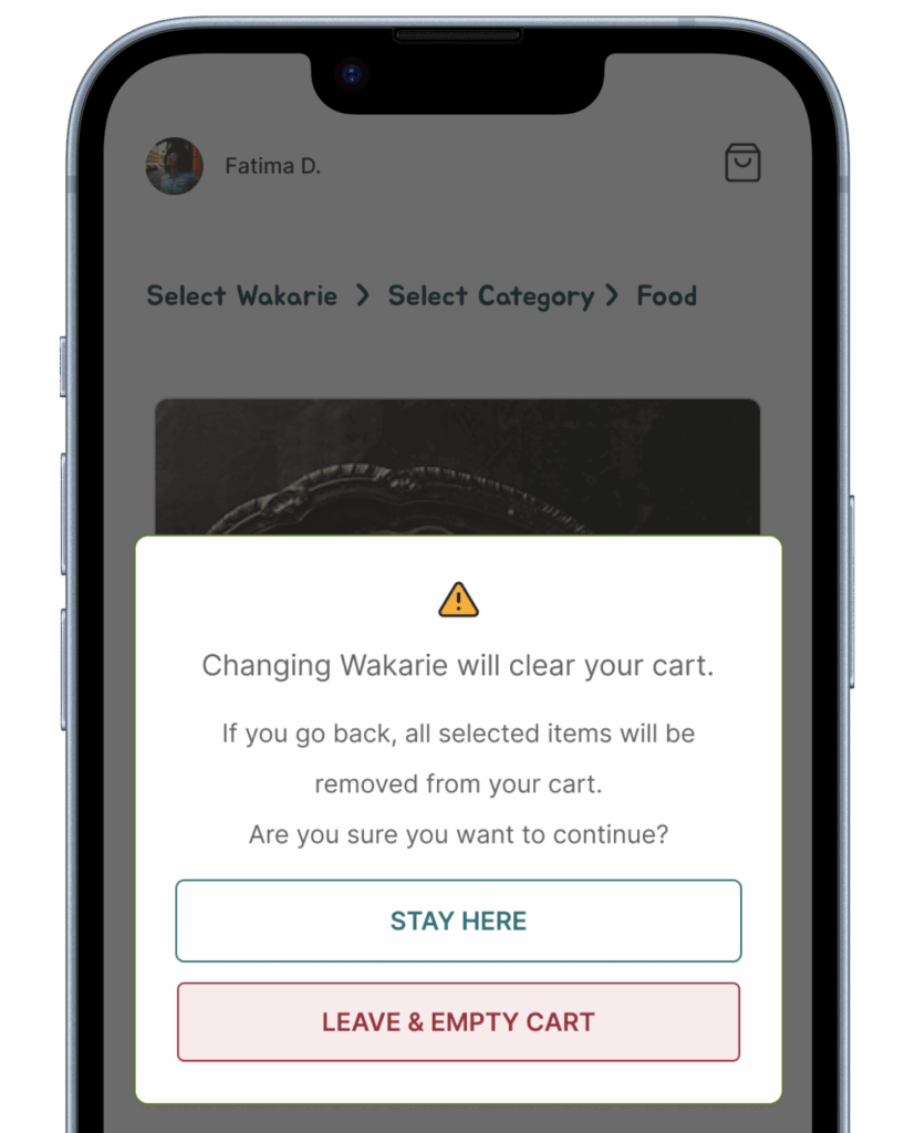
To address a critical system constraint that forced the cart to reset when users returned to the category selection step, I designed the flow to prevent unintentional navigation back.
Rather than allowing users to go backward and potentially lose their selected items, I integrated a linear, cart-centric flow that:
emphasized forward navigation,
visually isolated the product selection phase,
and clearly communicated when the cart was cleared due to system logic.
This prevented data loss and reduced the risk of user frustration, aligning with Nielsen’s error prevention heuristic.
Solution
- I integrated breadcrumbs with clickable steps to provide immediate navigation feedback and keep users oriented.
- I designed dynamic, anticipatory alerts that proactively notify users:
“Going back will clear your cart. Do you wish to continue?” - I provided a step-reset confirmation to ensure users fully understand the consequence before finalizing their action.
Key Takeaways
- Adapted UX flow to strict system constraints without compromising clarity or user control.
- Designed clear, accessible alerts to protect users from accidental data loss and maintain trust in critical moments.
- Preserved system integrity while delivering a reliable, frustration-free shopping experience.
Visibility of System Status
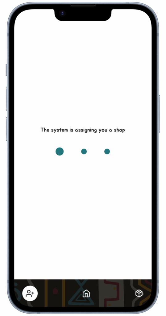
During asynchronous processes like shop assignment or beneficiary loading, I used loaders to clearly communicate system activity—even in low-connectivity environments.
Design Decision – Multi-category Shop Feedback
Context
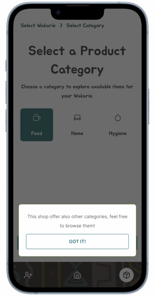
When a shop is assigned to a user (buyer), the system does not initially reveal whether the shop offers multiple product categories. This information becomes available only after selecting one category.
Problem
This delayed visibility could lead to confusion or redundant interactions (e.g., users returning back and forth between steps to check available categories).
Solution
To maintain clarity and respect user autonomy, a contextual feedback system was implemented:
When the user selects a category and the assigned shop offers other categories as well,
A lightweight informational popup appears, notifying the user that more categories are available.
The user can then decide to continue with the current category or explore other options.
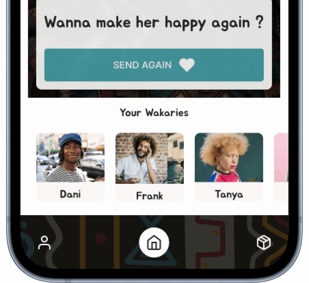
Mobile Navigation – Design Overview
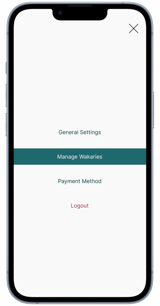
The mobile interface features a 3-tab bottom navigation tailored to the buyer’s key actions:
Add Beneficiary – manage and add recipients
Home – central dashboard for accessing all services
Explore Products – browse and purchase items
This structure ensures quick access to all core flows with minimal effort.
Secondary actions (e.g. payment methods, account settings, order history) are moved to a drop-down menu, to reduce clutter and prioritize action.
A notification panel appears only when needed, following a progressive disclosure logic to avoid interruption and maintain flow continuity.
Designing for Emotional Connection
One of the key product requirements was to create emotional touchpoints beyond transactional interactions.
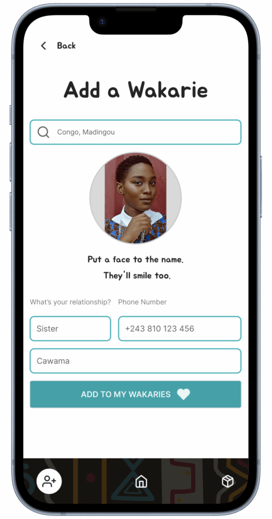
To meet this goal, I deliberately designed the process of adding a Wakarie to feel personal and emotionally relevant from the very first step.
I encouraged users to put a face to the name immediately, strengthening the sense of human connection and making the buyer feel genuinely closer to their Wakarie.
To further support this emotional layer:
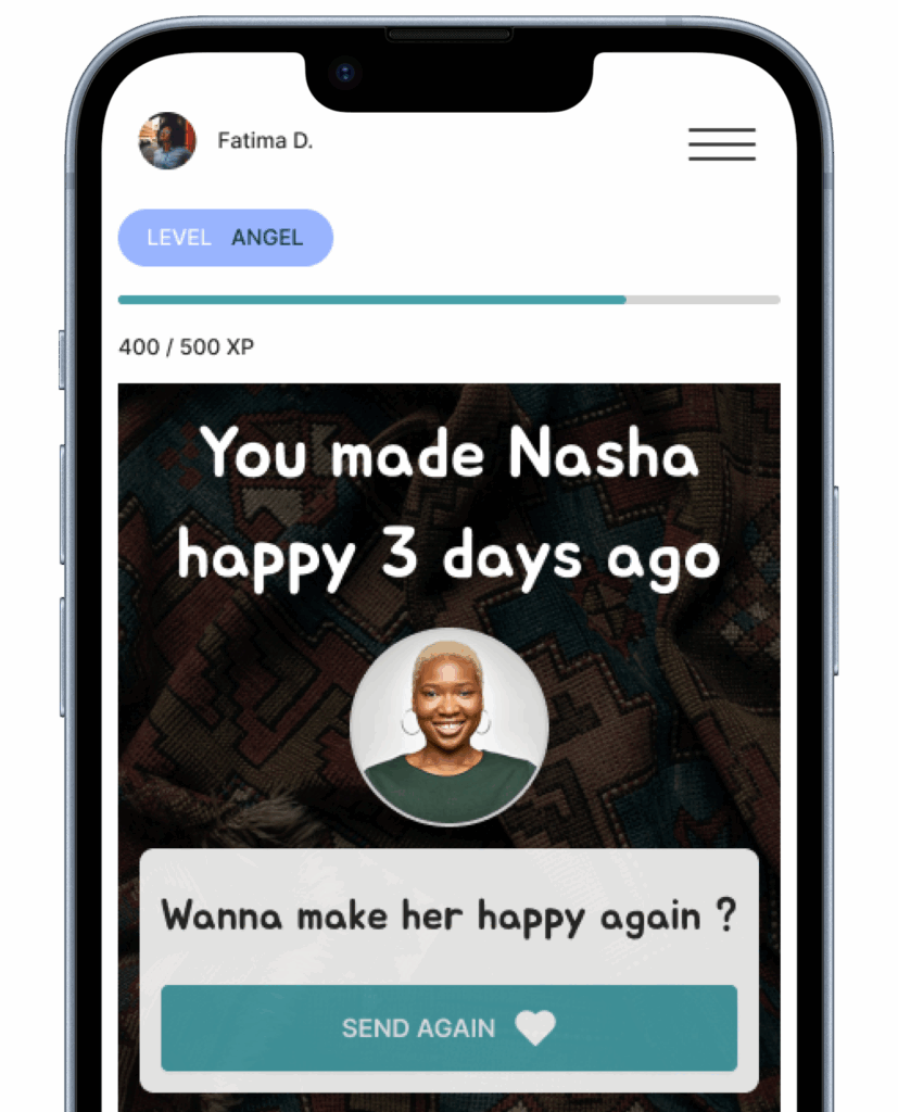
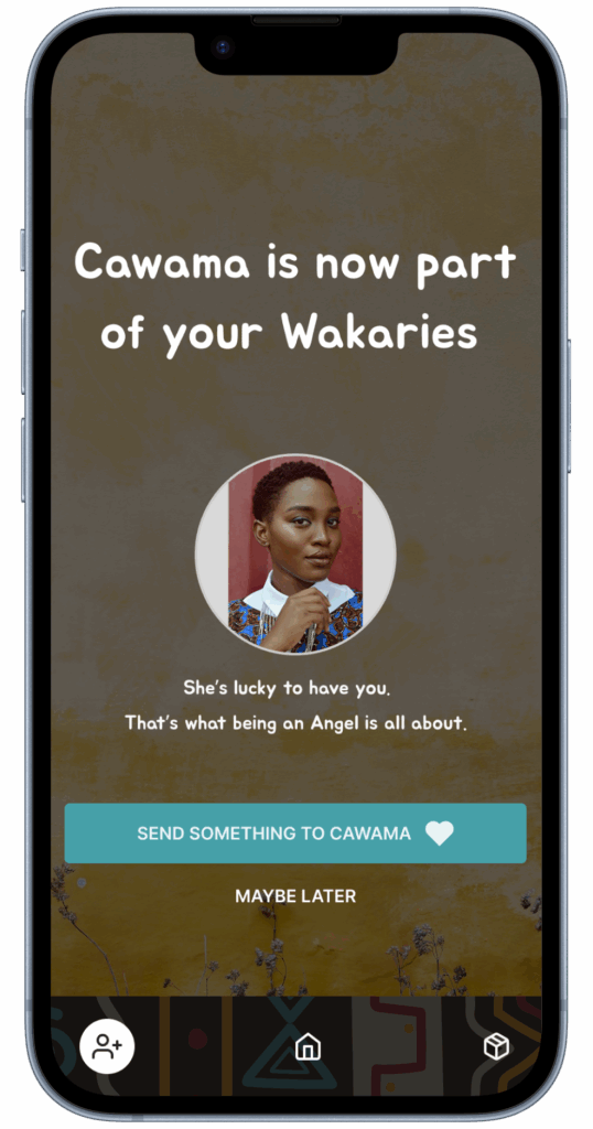
I designed confirmation screens that celebrate the relationship, positioning the user as someone who brings happiness and support.
I crafted personalized action buttons such as “Send something to Cawama”, designed to evoke emotional engagement and gently guide users to continue their journey.
This was a strategic UX decision to increase user motivation and long-term engagement, fully aligned with the product’s core mission: building lasting, human-centered connections.
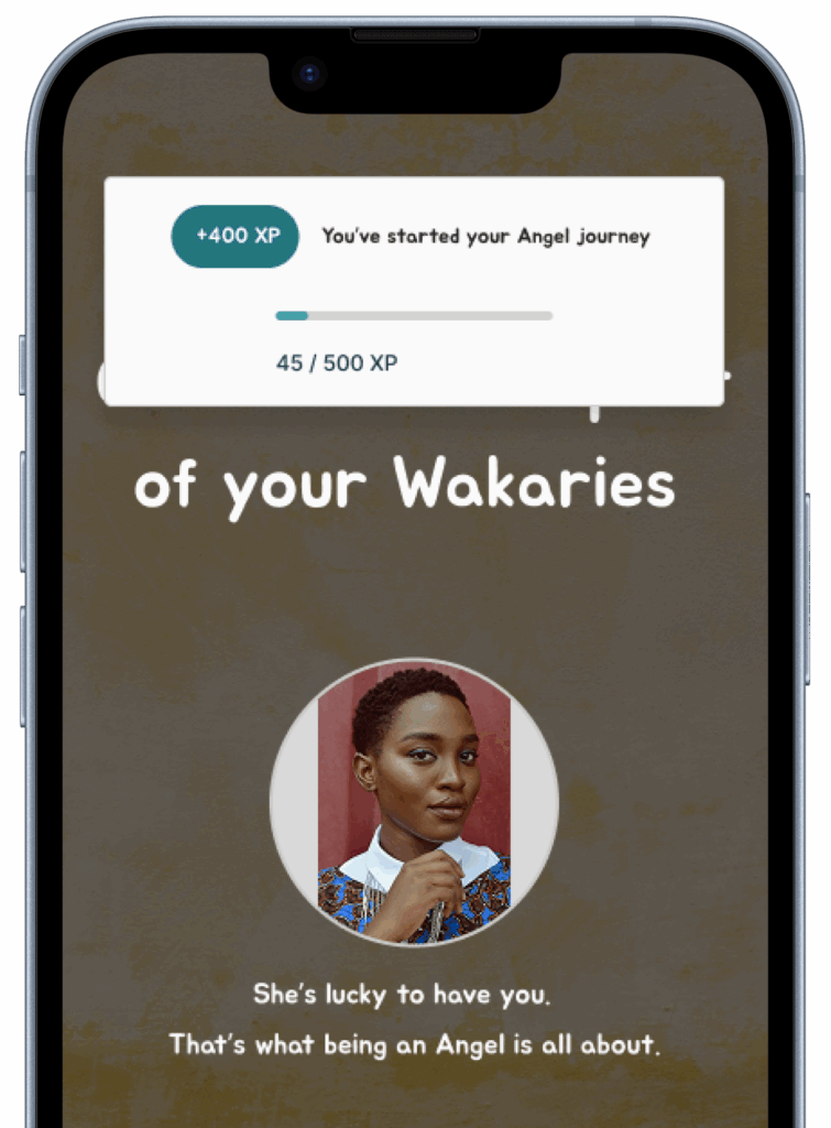
Empathy-Driven Gamification:
Rewarding Action With Purpose
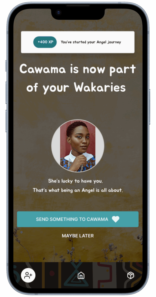
To enhance user engagement and create a sense of meaningful progression, I introduced a lightweight gamification model that reinforces emotionally-driven actions.
Rather than using generic points or badges, the system delivers contextual XP rewards through empathetic pop-up notifications. Each action—such as adding a Wakary or completing a first order—triggers visual feedback that frames the user not just as a buyer, but as a caring actor in their relative’s life.
This XP progression is not tied to extrinsic rewards yet. The goal is to build intrinsic motivation and a feeling of purpose:
You help, you progress.
Planned evolutions include:
Tiered Angel Levels (visual recognition)
Community milestones
Impact metrics (e.g. goods sent, families supported)
This approach ties gamification directly into the emotional core of the experience: supporting loved ones across distance.
Qualitative Metrics
Internal validation and reviews confirmed the clarity of the new flow.
The cart reset alert was tested and refined based on early feedback.
Both moderated and unmoderated usability tests were conducted to validate key interactions.
Further usability testing is planned for the next development phase.
Learnings & Next Steps
Managing UX within strict system constraints requires designing flows that anticipate system behavior without damaging user trust.
Reducing friction in operationally complex processes can significantly improve perceived usability and user satisfaction.
Expand the design system to fully support vendor and admin interfaces.
Prepare additional components and documentation to scale the platform.
Plan usability testing on a live environment to validate the optimized flows with real users.
Design File and Current Status
The buyer and vendor flows presented here are fully designed and structured as part of an MVP (Minimum Viable Product). They are available for exploration via the link below.
The design system is under active development, currently including all essential components required to support the buyer and vendor experiences.
I am following a progressive documentation approach: while the flows are finalized and ready for review, the design system will be published as a fully documented resource in its next release.
(Additional design system materials are available upon request.)
Vendor Study Case: Coming soon. The page will be available shortly.


